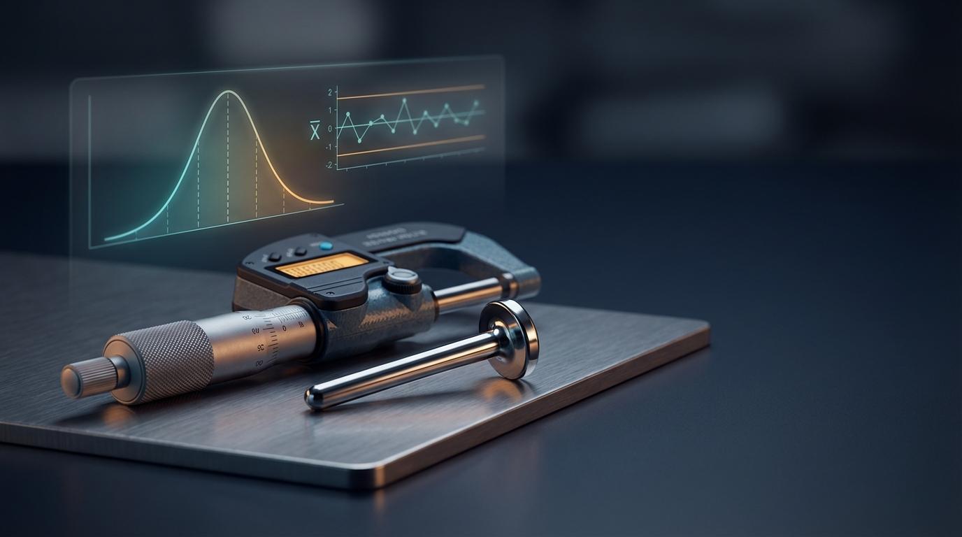
Western Electric rules are eight pattern tests applied to a control chart in addition to the standard 3-sigma limits. A point can sit comfortably inside its upper and lower control limits and still fail a Western Electric rule, because the rules catch drift, trending, and stratification patterns that a single out-of-limits point would miss entirely.
Quick reference:
- Rule 1: 1 point beyond 3-sigma
- Rule 2: 9 points in a row on the same side of the center line
- Rule 3: 6 points in a row steadily increasing or decreasing
- Rule 4: 14 points in a row alternating up and down
- Rule 5: 2 of 3 consecutive points beyond 2-sigma, same side
- Rule 6: 4 of 5 consecutive points beyond 1-sigma, same side
- Rule 7: 15 points in a row within 1-sigma (stratification)
- Rule 8: 8 points in a row beyond 1-sigma, either side (mixture)
The Analyze module runs all eight against X-bar R, X-bar S, I-MR, and the four attribute charts, and the platform also runs a background check after every inspection form is submitted. 30-day trial, no credit card required.
Nobody sits and watches a control chart update in real time. The chart gets pulled up when a part fails, or at the end of a shift, or once a week for the SPC binder review. In between those moments, a process can walk. Nine consecutive readings drift half a sigma high. Every one of them is still inside the control limits. Nothing trips. Nothing gets flagged in the spreadsheet macro that only checks whether today's value crossed the red line. By the time a point actually breaches the limit, the process has been out of control for two shifts and nobody who looked at the chart in the meantime would have caught it, because a single-point check was never built to catch it.
This is exactly the failure mode the Western Electric rules exist to close, and it is why a capability index and a control chart answer two different questions.
A capability number is a snapshot. A control chart is the record.
Cpk and Ppk, covered in detail here, compress a whole study into one number: how well does this process fit inside the spec limits, given a fixed set of data. That number is correct the moment it is calculated and says nothing about what the process does next. A control chart is the opposite instrument. It plots every subgroup or individual reading over time against a center line and control limits derived from the process's own historical variation, and it keeps accumulating evidence with every new point. A Cpk of 1.51 calculated last month tells you nothing about a process that has been quietly trending upward since Tuesday. The chart is built to tell you that.
Which chart for which data
QualityEngineer.ai's SPC engine (backend/app/services/stats/spc.py) exposes seven chart types, matched to how the data is actually collected on the floor:
- X-bar R: variable data collected in subgroups, using the subgroup range to estimate sigma. Standard choice for subgroup sizes up to about 10.
- X-bar S: variable data collected in subgroups, using subgroup standard deviation instead of range. Preferred once subgroup size exceeds 10, where range starts losing efficiency as a variation estimator.
- I-MR (Individuals and Moving Range): variable data collected one reading at a time, no natural subgroup. Common for low-volume or destructive-test characteristics where you can't batch five parts into a subgroup.
- p-chart / np-chart: attribute data, proportion or count of defective units per sample.
- c-chart / u-chart: attribute data, count of defects per unit or per unit of area.
Picking the wrong chart type for the data is its own source of false alarms. A p-chart run on a fixed sample size and an np-chart run on a varying sample size will both produce control limits that don't actually reflect the process, which is why the tool asks for the sampling method up front rather than assuming.
What the eight rules actually check
Rule 1 is the one everyone already knows: a point past the 3-sigma limit. That's the whole test a lot of shop-floor SPC training stops at, because it's the easiest to see on a hand-drawn chart with a ruler.
Rules 2 through 8 exist because a process can misbehave without ever crossing that line. Nine points in a row on one side of center (Rule 2) means the process mean has shifted, even if every point is technically in tolerance. Six points steadily climbing or falling (Rule 3) catches tool wear or a drifting fixture before a single reading is actually out of spec. Fourteen points alternating up and down (Rule 4) flags over-adjustment, usually two operators or two gauges feeding the same chart and fighting each other. Rules 5 and 6 tighten the net around the 2-sigma and 1-sigma bands, two of three or four of five points crowding one side. Rule 7, fifteen points hugging the center line, sounds like good news but usually means the subgroups are being mixed from two different sources with the variation averaging out, which is stratification, not stability. Rule 8, eight points straddling both sides of 1-sigma without settling near center, is the same mixture problem from the other direction.
All eight are implemented (backend/app/services/stats/western_electric.py), and the interactive SPC tool at /stats lets you toggle any of them on or off per analysis. But the defaults are not uniform, and the distinction matters if you're comparing two charts and wondering why one flagged something the other didn't. Variable charts, X-bar R, X-bar S, and I-MR, default to Rules 1 through 4. Attribute charts, p, np, c, and u, default to Rule 1 only. That's a deliberate difference, not an oversight: trend and pattern rules were derived from and validated against variable data with a roughly continuous distribution, and applying them naively to count data produces more false positives than useful signal. If you want the full set of eight on an attribute chart, the checkboxes are there, but you're opting into more sensitivity on data that doesn't always behave the way the rules assume.
Two different systems are watching, and only one of them calls it in
This is the part that matters more than the math, and it's easy to miss if you only ever use the interactive chart.
Pull up /stats and run an X-bar R chart by hand, and a flagged violation gets you exactly two things: a red marker on the plotted point and a plain-text line in the violations list underneath the chart, with the rule number, the point index, and the value. You can save that analysis to the part's history. Nothing else happens automatically. It's a diagnostic instrument, not a watchdog. You have to be the one looking at it.
A second path runs without anyone opening a chart at all. Every time an inspection form is submitted with variable measurement data, the platform pulls that characteristic's full measurement history and runs an X-bar R or I-MR chart against it in the background (_run_post_submission_spc in backend/app/services/inspection_form_service.py), using the same default Rules 1 through 4. If a violation comes back, what happens next depends on the severity rating that characteristic's PFMEA already assigned it, not on a separate SPC-specific severity someone has to define twice:
- Severity 5 and above: every user in the org gets a notification, titled "SPC Warning" or "SPC Critical," linking straight to that part's inspection record with the SPC tab already open.
- Severity 8 and above: the system auto-creates a CAPA. The description states the rule violation, the PFMEA severity rating, and pulls the characteristic's own reaction plan text directly into the CAPA's containment action field, the same reaction plan field your control plan already documents (see the control plan breakdown for what that field is supposed to contain). If no reaction plan was ever defined for that characteristic, the CAPA says so explicitly instead of shipping empty.
- Severity 10: the row escalates further, from a CAPA to a full NCR, with its own NCR number.
That's the mechanism IATF 16949 Clause 9.1.1.1 is actually pointing at when it requires a reaction plan for characteristics that are statistically unstable or not capable: the standard doesn't just want a chart on the wall, it wants a defined response the moment instability shows up, and it wants that response tied to how serious the failure mode actually is. A Rule 3 trend on a cosmetic dimension and the same Rule 3 trend on a critical characteristic with a PFMEA severity of 9 are not the same event, and treating them the same, either by ignoring both or escalating both, misses the point of risk-based control. Tying the auto-CAPA threshold to the PFMEA severity already on file means the escalation logic doesn't have to be maintained twice.
One honest limit: this automatic watch only fires for variable characteristics with at least 10 historical measurements, and only runs X-bar R or I-MR, whichever the characteristic's configured chart type resolves to. Attribute characteristics and X-bar S charts are covered by the interactive tool, not by the automatic post-submission watch, at least as shipped today.
What this replaces on a spreadsheet macro
The version of this most teams already have is a chart in a shared workbook with a conditional-formatting rule that turns a cell red when a value crosses the calculated limit. That's Rule 1, and only Rule 1. It requires someone to open the workbook, and it has no concept of PFMEA severity, no reaction plan lookup, and no path to a CAPA number without someone doing that by hand after they notice. The gap between "a point crossed the line" and "a trend that never crossed the line but was still a real process shift" is exactly the gap Rules 2 through 8 close, and the gap between "someone happened to be looking" and "the system checked after every submission and knew who to notify" is what the automatic path closes.
Get started
The Analyze module runs all seven chart types with the full Western Electric rule set available on demand, and the Build module is where a characteristic's PFMEA severity and control plan reaction plan get set in the first place, so the automatic post-submission watch has something real to escalate against. Start a 30-day trial, no credit card required.
FAQ
What are the Western Electric rules?
Eight statistical tests applied to a control chart to detect non-random patterns, beyond a single point crossing the 3-sigma control limit. They were originally published by Western Electric Company in 1956 and are also referred to as Nelson rules after Lloyd Nelson's 1984 formalization.
Do I need all 8 rules running on every chart?
No. QualityEngineer.ai defaults variable charts (X-bar R, X-bar S, I-MR) to Rules 1 through 4 and attribute charts (p, np, c, u) to Rule 1 only, because the pattern rules were derived for continuous variable data and produce more false positives on count-based attribute data. All 8 are available as checkboxes on the interactive chart if you want the wider net.
Which chart do I use for individual readings with no subgroup?
I-MR (Individuals and Moving Range). It's the right choice when you can't batch multiple parts into a subgroup, low-volume runs, destructive testing, or any characteristic measured one part at a time.
How many subgroups before a chart is trustworthy?
Twenty to twenty-five subgroups is the conventional minimum before control limits are considered stable, the same floor used for PPAP Element 11 initial process studies. QualityEngineer.ai's automatic post-submission SPC check uses a lower floor, at least 10 individual measurements, since it's watching for gross pattern violations on an accumulating history rather than establishing baseline limits for a formal study.
What does "beyond 2-sigma" mean in practice?
It means a point fell between the 2-sigma and 3-sigma boundary, inside the control limits but further from center than about 95% of points should fall if the process is behaving normally. One point there is unremarkable. Two of the last three there, which is Rule 5, is a specific enough pattern that it's statistically unlikely to happen by chance and worth investigating.
Does a rule violation automatically create a corrective action?
Only through the automatic post-inspection-submission path, and only above a severity threshold. A violation on a characteristic with PFMEA severity 8 or higher auto-creates a CAPA; severity 10 escalates it to an NCR. Violations found by running the interactive SPC tool manually do not create a CAPA on their own, they surface as a marked point and a message, and the analysis can be saved to the part's history.